Both Keymolen and Cavoukian argue that more transparency is key to create more trustworthy digital products. Moreover, the GDPR, the European Privacy legislation that will come into effect, explicitly calls for more transparency for end users (data subjects) Key Changes with the General Data Protection Regulation
(2018)
on the use of their personal data. When we look at Keymolen’s suggestions and the advice she provides, we can conclude that more transparency on the creation of smart artefacts can be achieved with not only providing insight in the element of Context, but in Curation, Construction, and Codification as well. When we aim at creating a design method for designing more trustworthy interfaces, we will need to take transparency on all of these elements into account. Keymolen refers to Anthony Giddens to explain the principle of trust by noting that “Trust no longer is pre-given, but involves a “mutual process of self-disclosure”. (Giddens in Keymolen, 2016:84) Self-disclosure and transparency are paramount when it comes to trust. How are we going to embed these in a design process?
If we want to start a design process that truly enhances trust in the interfaces of smart artefacts, we need to get some people around a table. At least an interface designer and an end user, but also experts that represent the 4 elements of trust in smart artefacts, as proposed by Keymolen.
To enable designers to engage in a more trustworthy design proces, means we need to create a situation that provokes this ‘mutual process of self-disclosure’. To begin with, we need to establish three things. First, we need to pinpoint the parties that will need to disclose themselves; second, we need to find out to whom they will need to disclose themselves to and third, we need to clarify what they will need to disclose to each other and themselves.
In true spirit of human-centered design, the most important party would be one or more end user, or better: data subject representatives. These will be the people who will assess whether the smart artefact or service that is to be designed is trustworthy enough. Whether it will be a direct end-user or an individual whose data will be used by the smart artefact or service (such as the grocery vendors in the Food on Route-app), these people will experience the consequences of possible mishaps with their personal data.
As we observed earlier, an average data subject will probably not have enough knowledge to gain insight in all four C’s of Keymolen’s model. If we want to create true transparency, this means we need to have at least one competent representative present for the element of Construction, one for Curation and one for Codification. It will be the interface designer’s task to funnel this process into the element that represents the interface and the artefact itself: the Context.
Apart from representing the element of Context, the designer will have to play a moderating role. For the element of Construction, an engineer and/or programmer/developer could be present. When it comes to Curation, a business strategist or marketeer could apply. For the element of Codification, we could look at legal experts or a Privacy Officer. Summarizing, the minimal people present in such a process of mutual disclosure would be five, who should be physically present at the process.
To help all participants to get an image of the intended functionality and technological underpinnings, we need a shared mental model, in the form of a narrative. This will be visual narrative, in the form of physical, plastic icons, in different colors.
One of the most important findings from the research with the cultural probe as discussed in chapter 3 was, that by explicitly showing which personal data was being collected, stored and shared, the participants developed a heightened awareness. If not already, they became more conscious about the data they shared. This seemed to be useful for the intended toolkit. So a clear visual representation of the basic functionality and the data the smart artefact at hand would store, aggregate and share would be useful. Alan Cooper refers to such a representation as a ‘Mental Model’.
A mental model is the general idea a user has about a certain product, without any details or nuance. (Cooper 2014:16) The opposite, the implementation model, reflects the raw technology (Cooper, 2014:17), or: Esther Keymolen’s element of Construction. The user’s mental model should be dominant when it comes to developing the user interface for such an artefact. When designing a usable product, or in our case: a user-friendly interface, we speak of the Implementation Model. Ideally, the implementation model, Cooper states, follows the mental model as closely as possible.
Cooper explains that a good way to come to understand how this implementation model should match the mental model is designing interfaces using scenarios. Or in his own words: “A narrative as a Design Tool” (Cooper, 2014:102)
‘Narrative [also] lends itself to effective visual depictions of interactive products. Interaction design is first and foremost the design of behaviour that occurs over time. Therefore, a narrative structure combined with the support of fast and flexible visualization tools (such as the humble whiteboard) is perfectly suited for motivating, envisioning, representing, and validating interaction concepts.’
About Face 4
(A Cooper, Reimann R, Cronin D, Noessel C, 2014)
Indianapolis: John Wiley & Sons, Inc.(Cooper, 2014:103)
By using this narrative structure while using some basic conventions on important actors and elements in the process, a shared mental model can be created. This provides the same visual representation of the basic functionality and the data the smart artefact at hand would store aggregate and share, for all participants to see. A prototype for visualizing this narrative structure was created using a physical set of icons that represent elements like metadata, data connections, encryption and storage. Next, there are icons that represent stakeholders in the process. All these icons are available in red and green, to provide the participants a way of letting know they distrust or trust that certain element. In blue, we have icons that represent larger organisations such as the manufacturer’s company, the government but also a hospital and an MD. This set could be extended with organizations such as Secret Service, Police and Privacy Enforcement Organizations.
Last, there are icons of well known smart artefacts to set up a few scenarios: A Tesla, A Bluetooth Toothbrush and a NEST thermostat. These smart artefacts would provide concrete scenarios to discuss with the participants. They initially were meant as a proof-of-concept, but can be used as a warm-up method as well. Providing these elements instead of allowing participants to sketch the scenarios themselves was important in establishing the shared mental model: the visual representation could not be marred by bad drawing skills or misinterpretation of drawings. However, it is paramount that all participants, especially the data subject representatives, actively participate in building the scenarios and the creation of proposals for interfaces.
In order to give end user representatives a clear hand in the design process, and have them experience as much transparency as possible, end users are asked to reflect on the scenarios from a privacy point of view and to sketch their own ideas of how an interface for the intended smart artefact should look like.
In the early 1980’ies, –who, together with Tim Mott, was responsible for the design of the Desktop Metaphor– used participatory design to create and develop tests for the UI’s of many XeroX PARC apps at a very early stage. Tesler describes how he would get a secretary who had just started at PARC and had never worked with any of the programs yet, to see if he could have her participate in a design session for a word processing application. He sat her in front of a blank screen and explained how the basics of a mouse worked:
“Imagine there is a page on the screen and all you’ve got is this device that you can use to move a cursor around, and you can type”, I Said. You’ve got to make some changes to this document. How would you do it?” I gave her a paper document with lots of markups on it for reference and asked her to imagine that is was on the screen. She just designed it right there! “I would point there, and then I would hit the delete key,” she said.
Designing Interactions
(Moggridge B.J., 2007)
(Moggridge, 2007: 64)
By using novice computer users or even laymen, who had no experience whatsoever with computer interfaces or computer technology as participants, Tesler could have the most transparent, straightforward and honest design sessions possible. By providing the right tools to create a narrative, he could make these participants design an interface that was the most logical solution to them.
This very same approach was chosen as a starting point for the toolkit. All participants are provided with a notebook with the same form factor as the cultural probe, mentioned in chapter 3, and are asked to sketch proposals for interfaces based upon the visualized shared mental models on the table. Participatory design with representatives of all four C’s as mentioned earlier is important, because every representative needs to have a voice in the design process and needs to reflect on the implications of opposing views. Only in such a way a trustworthy and transparent design process can be achieved.
Every representative will be asked to reflect on their individual mental model of the artefact or service, based upon their individual expertise. That mental model should become visual for all other participants, to have an informed and transparent discussion. Furthermore, they all should have a voice in how the interface should translate their mental model from their perspective. Furthermore, for every representative the visualization is the same, so comparing interpretations and view points will be a lot easier.
When using participatory design to create proposals for interfaces, the designer should play the role of moderator.
As stated above, the designer at the table will take the role of moderator. That means the designer will need to set the “rules of engagement” and will help set up the visualisations of the scenarios. This also means that the designer proposes the guidelines and criteria that will be used to assess the scenarios and the iterations which will be proposed at the table. The designer will need to ask all participants to clarify their views on the scenario and make sure that everyone pitches in when it comes to offering insight in the specific elements of the scenarios, be it on the level of Context, Curation, Codification or Construction.
It is also the designer’s responsibility to make sure the end user representatives provide design cues for the interfaces they would like to see, based upon the findings in the scenarios. The toolkit can be used in combination with design principles such as the Privacy by Design – The 7 Foundational Principles.
(Cavoukian A, 2009)
7 principles of privacy by design. The toolkit has proven to give a more concrete context for these principles, offering the participants a clear context to form their opinion and ask each other questions.
The proposed toolkit consists of laser-cut artifacts that represent icons and images. Those artifacts can be used to construct visual mental models, which can be photographed and recorded on video.
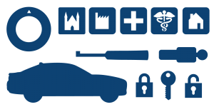
These shapes and icons represent smart artifacts, important actors and organizations: a NEST Thermostat, a Bluetooth Toothbrush, a Tesla, the Government, a manufacturer, a health insurer, an MD, the data subject and and the data subject’s home.
These icons represent trusted and untrusted data, connections, storage and stakeholders: time, data connection, voice data, storage, location and stakeholder.
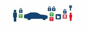
This is an example of a visualized scenario: A Tesla car is connected to the user’s smart phone, but also with Tesla Headquarters. Questions concerning trust in the smart artefact ‘Tesla’ that need to be answered in order to create insight in how data is treated by the manufacturer: How are the connections encrypted? Who has access? What will happen to that data?
Currently, the toolkit has been reviewed and tested by using realistic, pre-given scenarios using IoT-artefacts and connected services. In its latest iteration, the rules of engagement were provided by following the principles of Privacy by Design by Ann Cavoukian. For recording the results, every participant is provided with a notebook to make notes and sketches, via an overhead camera and a camera on a tripod, the session was recorded for later review.
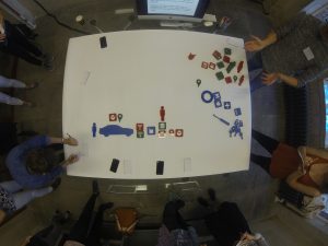
First session with the toolkit: overhead recording
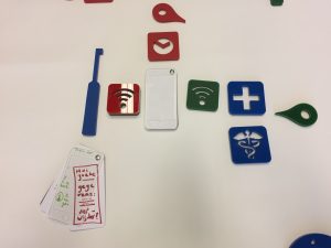
Notebooks in the shape of a smartphone to propose user interface designs that are more trustworthy
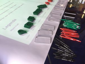
The prototype of the design tool has been tested at various places and using the findings these sessions, it has has been gradually improved. At this moment, a there are several possibilities for adaptation in present design strategies.
To gain knowledge in the possible application of this tool and in which context it could be of use, I have conducted several validating and prototyping sessions. The aim of these sessions was twofold. First, I wanted to show the then current iteration of the tool with designers, law professionals, privacy specialists, ethicists, business analysts and software developers, in order to see if they would grasp the concept and the used principles. Second, by using the tool as a conversation starter, I was looking at possible practical applications.
During the Design Research days and the Design My Privacy Rotterdam 2016 event at Willem de Kooning Academy and at Backfire Event Zaandam 2017 I tested the prototype with random participants, most of whom were designers or artists. Apart from that, there were sessions at the Dutch Ministry of Justice and Security, TNO en NEDAP B.V. in Groenlo, the Netherlands. The first sessions were mainly aimed at gathering input from fellow designers and to see if the concept actually worked. I used the input of my fellow designers as reprentative for a validation of the first fo Keymolen’s C’s: Context.
The session at the Dutch Ministry of Justice and Security was aimed at establishing whether the tool could be useful within privacy legislation or privacy law compliance. This is important as it represents the Codification-part of Keymolen’s four C’s.
At TNO, I aimed at finding out whether the tool would be suitable for creating a privacy-centered business model. TNO’s RESPECT 4U-model (which will be clarified further on) aims at organizing a business around the proper use of personal data. This would qualify as a representative of the Curation-element.
Last but not least, at NEDAP I was looking for input from professionals that represnt the Construction-element. As NEDAP is a large technology company and develops software that helps tens of thousands of people on a daily basis, their views on the tool was important, as it would help me to gain insight in how the Tool would be of use when developing hardware and software.
Here follows a summary of the most important findings of every prototype and evaluation session conducted thus far.
Maakplek Groningen is a location in the city of Groningen that provides a maker space, a tinkering lab if you will, to people that are interested in experimenting with technology and production means such as 3d printing, wood working and electronic circuitry. The resident makers are always interested in new, creative concepts and show a critical view on technological applications. Many of them are or have been active in the hacker scene so there is a lot of knowledge on the inner workings of smart artefacts. I showed the set of icons and provided a broad sketch of the concept I had in mind.
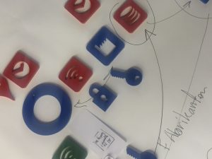
At that moment, I just aimed at visualizing data connections. The scenarios I had in mind were quite vague, and I asked the participants how they would use the tool or would improve it.
N/A There were no real scenarios, I provided the IoT-elements as icons and tried to discuss them as they were.
This session was primarily aimed at making sure whether participants would grasp the concept of visualizing data scenarios with the icon set I had made. As most participants were technology savvy people, they did understand the concept of visualization and offered suggestions to convert the tool into a visual UML-tool. UML is a schematic mark-up language to design data structures and to visualise activity diagrams for software.
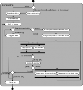
Activity diagram in UML, source: https://en.wikipedia.org/wiki/Activity_diagram
Although the set of icons was received well, I realized I had to create a clear set of scenarios to discuss. Apart from that, I had used a large piece of paper for the icons to be arranged on and invited the participants to use markers to make drawings and notes on the same piece of paper. This turned out to to me a bit of a hassle. I decided to supply future participants with personal notebooks.
The toolkit might be useful as a visual aid when designing UML diagrams.
At the Design Research Day at Willem de Kooning Academy I had prepared more concrete scenarios and I had provided all participants with notebooks with the form factor of smartphones, just like the probe diaries.
This session was the first session where four different scenarios were made available and the participants were invited to provide sketches of more trustworthy interfaces, based upon these scenarios. Through the NEST thermostat Google could know a lot about your daily life. By analysing your data, Google could tell when you are home, where you live and tell if you have an irregular sleeping pattern.
We only used the first scenario, and because there was no clear timeslot, the discussion that was sparked by the first scenario took up most of the time for the complete session.
We never came past the first scenario. Because of lack of ‘rules’ and restrictions, the prototyping session ended up becoming a fiery debate on privacy and the results were vague and not really usable. Most participants said the found it hard to grasp the principles, but the first scenario gave enough material for discussing perceived personal privacy, trust in smart artefacts and government regulations. As a first prototyping session, it was valuable.
This session primarily showed that the discussion had to be moderated more thoroughly. Participants were in dire need of a set of rules or principles to properly assess the scenarios. Apart from that, the used icons were not always clear to most. Most participants were eager to cooperate and the discussion on privacy was heated, but it did not go anywhere. Concrete, practical conclusions could not be drawn. This proved that the subject was on top of mind, but that a more clear context had to be provided in order to make proposals on the design of trustworthy interfaces and artefacts.
Timelapse of the session:
Being invited by Deanna Herst, this conference provided a good opportunity to check how concept and the ideas I had, would be received by the –mostly privacy minded– participants of the conference. I was located in the central hall of Willem de Kooning Academy, which was not ideal. A calm, more focused location with less background noise would have been a better place to provide a show and tell on the toolkit.
There had been little time to adapt the toolkit, so the same setup was used. This session was primarily useful to interest other designers and participants of the congress.
N/A
This proved to be worthwhile, as the concept was received well and subsequently was introduced to legal experts from the Dutch Department of Justice and privacy experts from TNO. This offered a new opportunity for evaluating the toolkit.
I got acquainted with legal experts from the Dutch Ministry of Justice and Security and business analyst experts from TNO. This would prove to be a very valuable session for further development of the tool, because they could very wel represent two of the Keymolen’s four C’s.
As this and the previous session proved, I had to come up with a more concrete set of rules and a more clear goal for the design tool. This might provide the only proper to explain the concept to all relevant representatives and get everyone participating in the design process.
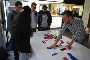
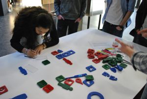
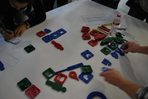
At this design iteration, the toolkit was adapted to work with the principles of “Privacy by Design” by Ann Cavoukian. This was done to provide restrictions and to provide a framework to work with. The session was preceded by a short keynote with slides and an explanation of the 7 rules of Privacy by Design as mentioned earlier (link) and how they could be interpreted.
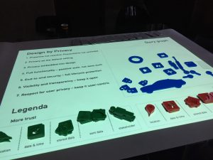
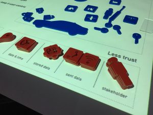
Using a beamer to project a ‘playing field’ on the table, while providing a legenda for all icons and artefacts at hand, it was for all participants more clear how the process should take place.
Since the participants all turned out to be creatives, designers and end user representatives, I suggested everyone to pick one Privacy by Design-principle and chose that principle to reflect on the scenarios of the Nest thermostat, the Bluetooth-toothbrush and the Tesla.
I then asked the participants in what way the interface of the service that scenario represented, could be designed to adhere more to the chosen PbD-principle. The results were much more concrete and offered creative views on how interfaces could be designed to offer more transparency about and control on personal data.
Nest, Bluetooth Toothbrush, Tesla.
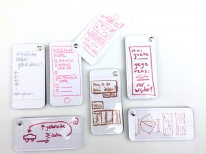
Some proposals made at the session
However, the principles of privacy by design remained vague, even when used within the constraints of this toolkit. The Interpretation of the rules was differed and led to some confusion amongst the participants. As the 7 principles of PbD are in fact quite vague and leave a lot of room for discussion, this is eventually what happened. However, participants made some very creative suggestions.
Footage of the session:
• Very creative and interesting ideas on interfaces that provide more control in data.
• The principles of Privacy by Design may not be the best suitable for adaptation in this toolkit.
• Setting stricter time boxes and following principles provided much needed structure in the discussions about the different scenarios.
It was time to discuss the tool with other relevant representatives to see what rules and contexts could be of use to further develop the tool.
After we first met at “Crafting Privacy” at WdkA an appointment was made with Drs. Meijer and mr. Shoae Bargh at the Dutch Ministery of Justice and Security. At Crafting Privacy, we had discussed the possible application of the design toolkit within the context of the new European Privacy Regulation (GDPR) and the Dutch Legislation that is based upon this regulation (AVG).
At the meeting, the toolkit was presented on sheets of paper, which had the playing field printed on them, as we could not set up a beamer in the conference room. I explained the way I envisioned the toolkit to be used and asked mr. Meijer and Shoae Bargh to reflect on the toolkit. I aimed at checking what application the toolkit could have from a legal or legislative point of view.
At this meeting we did not really went in-depth on the scenarios. It was more a general review of the concept of the toolkit than a real design/assessment-session.
One of the more promising ideas that was to see if the tool could be adapted as visual representation of the Privacy Impact Assessment (PIA), an assessment for checking if plans for smart artefacts and services comply with the European Privacy Regulation (GDPR) and the Dutch Privacy Law (AVG). On May 25th 2018, this law will be enforceable throughout Europe, so here is an urgent need for educating everyone that is involved in designing and building smart artefacts and services. Currently, the PIA is a very detailed, lengthy, and not really user-friendly checklist which is mainly meant to be performed by legal professionals or privacy specialists. Transforming the tool could enable designers to check if their concepts for smart artefacts comply with European Law.
One of the ideas that was to see if the tool could be adapted as visual representation of the Privacy Impact Assessment (PIA), an assessment for checking if plans for smart artefacts and services comply with the European Privacy Regulation (GDPR) and the Dutch Privacy Law (AVG). On May 25th 2018, this law will be enforceable throughout Europe, so here is an urgent need for educating everyone that is involved in designing and building smart artefacts and services. Currently, the PIA is a very detailed, lengthy, and not really user-friendly checklist which is mainly meant to be performed by legal professionals or privacy specialists. Transforming the tool could enable designers to check if their concepts for smart artefacts comply with European Law.
There are opportunities for adapting the toolkit for GDPR/PIA. This however, will take a lot of time (the GDPR is a complex law and implementation differs per country). Besides, it is the question whether it is a good idea to have a designer perform a Privacy Impact Assessment.
As TNO was the organization that participated in the development of the 7 principles of privacy by design and had shown interest in the toolkit, I met with mrs. Somayeh Djafari to discuss the toolkit. To be more specific, TNO has developed a framework or model, RESPECT 4U Paper (Dutch)
(Vermeulen P, Djafari S, van Lieshout M, 2017)
RESPECT 4U, that describes a broad set of focus points for a company that works with personal data, to operate in the most ethical and transparent way.
RESPECT stands for: Responsible, Empowering, Secure, Pro-Active, Ethical, Costs & Benefits, Transparent.As we discussed the design toolkit, we concluded it could be worthwhile to see if it could be used within the most relevant areas of the RESPECT4U model: Empowerment, Security and Transparency: these are the areas that have the most to do with the design of the interface of artefacts and services.
The four scenarios were briefly presented but not assessed.
TNO is currently working on a model that should enable larger organizations to adapt their business strategy, corporate culture as well as their products to a more privacy centered approach. This model, called RESPECT4U appeared to have similarities with the interface design toolkit, especially on the level of informing the end users.
The element of ‘Proactive’ within RESPECT4U refers to the Eight Privacy Design Strategies
(Hoepman J.H., 2012)
Privacy Design Strategy by Jaap-Henk Hoepman. (Pi-Lab/TNO) There may be possibilities for adaptation of the tool to help and visualize these strategies.
With: Stefan Vermaas (Product Developer) Steven van der Vegt (Lead Developer) Guus Droppers, (General Manager) Michel Glintmeijer (Privacy Officer NEDAP)
NEDAP Healthcare is a business unit of NEDAP NV, a large technology firm in the eastern part of the Netherlands. NEDAP Healthcare is a fast growing business unit, focusing on e-Health technology for nursing homes and hospitals.
I asked NEDAP if I could come by and show the toolkit and see if they would be interested and if they would have ideas for embedding such a toolkit in their design process.. The presentation was aimed to see if and how this tool could be used in a company like NEDAP. I proposed to look at one of their apps, such as their CAREN care-system and see if it was possible to visualize its basic functionality through the toolkit.
Similar to the session at the Ministry of Justice and Safety, the use of a beamer was difficult for this session. Therefore, the printed sheets of paper were used again. All 4 fictional scenarios were briefly addressed; we then discussed how such a toolkit could be used within the design process of NEDAP
We mainly discussed the role this toolkit could play in the design process of a large application or service. As it turned out to be, most applications developed at NEDAP use connections and/or code base that has been developed earlier. This makes it harder to review all data that is being recorded, shared and stored. However, for stand-alone applications and applications that connect to current databases could be reviewed using the tool. Especially the idea of a shared mental model was discussed extensively. It may help development teams in getting a better idea of the data model of an app and the possible risks that could be present.
The tool was received well, especially because the scenarios could be made so concrete. A proposal was made to use the tool as an assessment-tool that could provide insight in ‘data hygiene’. In other words: to use as little data as possible and to work as ‘clean’ as possible. Apart from that, all participants present thought this tool could provide visual ‘snapshots’ in the design process, in order to create a version history of data models. In that way, early choices made in the process can always be reviewed if problems do arise. Apart from that, it could provide a transparent design process towards data subjects that are interested in the construction of a certain app or service.
The tool could provide ‘snapshots’ of a design process, in order to create a clear version history of the choices made on the use of personal data. The tool could also be used as an ‘awareness-kit’, to help employees getting up to speed on ethical design and privacy regulations.
The idea of the tool al a ‘visual contract’ between end users and designers and developers was also seen as a possible adaptation. Mostly, functionality is agreed upon in writing, and often this leads to misunderstandings and disappointments. A ‘visualized contract’ on the inner workings of a proposed application or artefact may help in preventing such misunderstandings.
The toolkit is still a prototype, but could be used as a visualization tool to ensure GDPR compliance when designing smart artefacts and services. It also could be used as a Privacy Impact Assessment tool. Apart from that, there are possibilities to adapt the tool to Jaap Henk Hoepman’s Privacy Design Strategies or TNO’s RESPECT4U.
Although the toolkit technically is still in its infancy, the validation and prototyping sessions have proved that there is need for concrete design research tools that help designers and end users to discuss and design (interfaces of) smart artefacts and services. Whichever strategy or design principles will be chosen to merge into this tool, the principle of visualizing concrete scenarios concerning the use of personal data appears to be relevant, useful and necessary. Whether they are designers, business analysts, ethicists engineers or programmers, all have expressed interest in and need for a tool that enables them to create a shared, visual mental model on the way a smart artefact or service stores and shares personal data and that can be understood by end users.
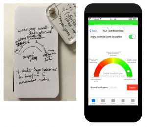
Example of a participant’s UI sketch and a UI rendering of that same proposal.
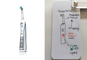
Example of a participant’s sketch for a ‘Privacy Switch’ on a bluetooth toothbrush and a rendering of that proposal
Another possibility would be in adapting the toolkit to work with the Eight Privacy Design Strategies
(Hoepman J.H., 2012)
Privacy Design Strategies by Jaap Henk Hoepman from Pi-Lab. This strategy has been developed to be put to use on the level of data processing, encryption and authentication and focuses less on the level of interface design. If we would use the 4C’s, its main focused is construction. Therefore, this strategy would only encapsulate one part of the design of a smart artefact of service. Just by focusing on construction, we run the risk of losing track of the other elements that are required to ensure these artefacts or services can be trusted.
At this moment, the biggest opportunity for the tool lies in its adaptation for designing smart artefacts and services using a design process that aims at GDPR/AVG compliance. Since this law will be enforceable on the 25th of May this year, there is a sense of urgency involved. If this could be done while keeping end user representatives informed on the choices made using the scenario snapshots as a visualized contract, true transparency in the design process can be achieved.